


BUILDING A BRAND FROM BARE BONES.
The client approached us with a great product line. The endeavour would be to build a serious yet approachable brand that stood for healthy, on-the-go nutrition for the urban go-getter.
Looks start with the logo
______
The logo symbol is a morphing “PLAY” button in bold purple with a custom-made logotype in bright yellow. The form we constructed was organic yet geometric, juxtaposing colours and layers for a look that was look fit yet friendly.
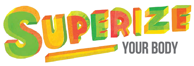
Foresightful Positioning
______
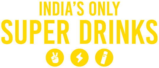
‘Superfood’ is currently the rage in the Western world and is slowly on the rise in India. It made sense to help the brand have a first-mover advantage over the prefix ‘super-‘ in this category given that Zago packs in all the essential nutrients needed for urban life.
Creating verbal and visual synergy
______
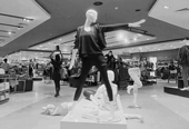
To strike the balance between focus and fun, the visual language presents clean, uncluttered black and white imagery complimented by a colourful and youthful brand call to “Superize”.
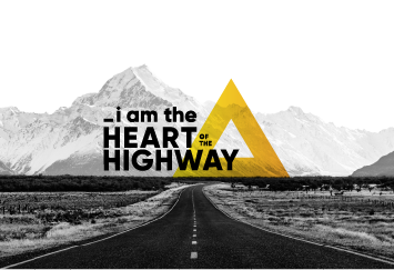
Lights. Camera. Action.
_____